Despite inflation being most commonly cited as the reason for Bitcoin’s price appreciation, there are other factors at play.
What do Peter Schiff, gold bugs, the financial media and many bitcoiners have in common? It is the shared belief that "money printing" is to blame for many, if not all, of the increases in price that plague our economy. While it cannot be argued that prices are increasing in certain areas such as in housing, stocks, bonds and lumber (albeit temporarily), I believe the source of those price increases comes from a different place than what most people tend to assume.
Over the past few months, I have been collecting information related to the topic of inflation and would like to use this opportunity to share my findings with the Bitcoin audience in particular. We will use this missive to try and identify the types of things one would expect to see in both inflationary as well as disinflationary/deflationary environments. We will also try to uncover some of the culprits that are most responsible for the increase in asset and consumer prices post–Global Financial Crisis (GFC).
Within the Bitcoin space, there are two topics that are guaranteed to get you positive attention. One is to promote the inflation narrative and the other is to promote bullish price momentum. Many of the articles that cover the aforementioned topics can be boiled down to mere cheerleading and often tend to lack substance in my opinion. Even though this missive will be covering the topic of inflation, it will actually be providing support for an alternative view than that which is most popular. This article may seem a bit long to most readers but not to worry, it is just as chart heavy as it is word heavy and the charts and illustrations we will be using will be helpful for our analysis.
In order to begin, we first need to identify the attributes of both inflationary and deflationary environments in terms of the social and economic behaviors that one might expect to observe in each type of environment. To do this, we will be utilizing historic precedent more often than not. We will begin our analysis by first identifying the attributes of a truly inflationary environment.
What Does An Inflationary Environment Look Like?In order to understand what to expect in an inflationary environment, we will be using history as our guide. We will be looking at the effects that inflationary periods have had on areas such as interest rates and consumer behavior. The inflationary episodes below are presented in chronological order and essentially cover the last century or so. We begin with Bolshevik Russia.
Soviet Russia"World War I and the Revolution of 1917 led to a period of unprecedented inflation. By 1917, the ruble had lost 75% of its 1913 exchange value; by 1920, it had lost 99.9% of its 1913 foreign-exchange value. The commodity price index rose 5800% between 1913 and 1918 and rose 4.9 million% between 1913 and 1921."— “A History of Interest Rates,” p. 598
One of the important hyperinflationary episodes that has been largely forgotten was the Soviet hyperinflation that directly followed the Bolshevik Revolution. The example provided above might remind people of more modern episodes such as the experiences of both Zimbabwe and Venezuela. So we know what was happening to the Soviet ruble during this time, but how did interest rates respond? According to”A History of Interest Rates,” deposit rates at the Gosbank were as high as 72% in 1923, but the text also indicates that these rates were not indicative of supply and demand, instead being determined by Soviet commissars, and thus would have likely been much higher. On the lending side, interest paid on loans exceeded 216% during the same year. Additionally, pawn shops could charge upto 120% for advances of credit. The aforementioned Soviet commissars controlled all aspects of banking during this period, so black market rates were likely to be much higher than those stated above.
Weimar Germany"The only thing to do with cash by that time (February 1922) was to turn it into something else as quickly as possible. To save was folly. Undoubtedly, however, as in Austria, there were many farmers who behaved outrageously. Dr. Schacht's account of the inflationary years recalled that farmers 'used their paper marks to purchase as quickly as possible all kinds of useful machinery and furniture-and many useless things as well. That was the period in which grand and upright pianos were to be found in the most unmusical households.”— ”When Money Dies,” p. 109
From a behavioral point of view, one of the things you would expect to see during a period of high to extreme inflation is for consumers to try and get rid of their rapidly depreciating currency as quickly as possible. During the years immediately following WWI, this is exactly what you saw in Germany. Consumers would rush to purchase whatever they could the moment they were paid. In fact, the situation got so bad that producers and retailers couldn't, and didn't want to, part with their wares and responded by limiting the number of hours that their doors were open otherwise their inventory would be quickly cleaned out and the shopkeepers would have been stuck with the rapidly depreciating German mark. Additionally, loans in excess of 10,000% were recorded in Germany during this period but due to the chaos of the hyperinflation, the occupation by the French of the Ruhr, and political extremism, true black market rates could have been much higher.
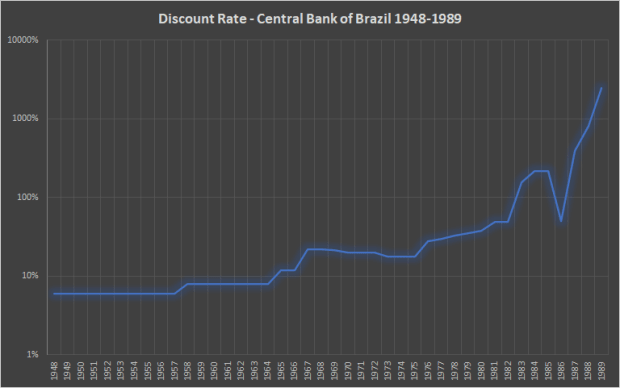
Figure 1. Discount rate for the Bank of Brazil, 1948–1989 (Source).The chart in Figure 1 is set to log scale due to the volatility in interest rates between 1948 and 1989. Following the military coup in 1964, the Brazilian government began the process of debasing the nation's currency, the cruzeiro, in order to combat the various crises that occurred over this period such as the 1979 Oil Crisis. The currency itself went through three iterations in total before finally collapsing in 1993 due to hyperinflation. We can clearly see from Figure 1 that interest rates went parabolic just before the final implosion of the cruzeiro, therefore, there is a clear cause-and-effect relationship between the money printing taking place and the rate of interest. When money is printed, the rate of interest is shown to increase as a consequence. We see this type of behavior time and again.
Argentina Figure 2. Deposit interest rate in Argentina, 1994–2021 (Source).Argentina's struggles with inflation are well known. The two main inflationary episodes of the last 20 years coincided with the Argentine Great Depression of 1998–2002 and the Argentine Monetary Crisis of 2018. During the peak of both crises, interest rates skyrocketed in response to the depreciating value of the peso. Figure 2 shows the rates of interest that banks have been paying their depositors over the last 25 years. At the time of writing, September 4, 2021, depositors are earning 34% interest on their deposits again, illustrating that periods of great inflation lead to large increases in the rate of interest.
The quotes and charts from the section above provide consistent evidence that high rates of inflation lead to higher and higher rates of interest. Furthermore, from a behavioral perspective, we saw that, during periods of extreme inflation, citizens would always try their very best to offload the currency for almost anything that couldn't be conjured from thin air. While not shown in any charts provided, it also bears mention that wages also tend to increase significantly in an effort to keep pace with the ongoing inflation. We will conclude this section with a quote from Milton Friedman regarding the relationship between interest rates and monetary policy:
“As an empirical matter, low interest rates are a sign that monetary policy has been tight — in the sense that the quantity of money has grown slowly; high interest rates are a sign that monetary policy has been easy — in the sense that the quantity of money has grown rapidly. The broadest facts of experience run in precisely the opposite direction from that which the financial community and academic economists have all generally taken for granted.”
We will keep part of this quote in mind as we continue to the next section.
What Does A Disinflationary/Deflationary Environment Look Like?Now that we have a thorough understanding of what an inflationary environment looks like, we can more easily identify the types of attributes that would define a disinflationary or deflationary environment. In this particular section, we will no longer be observing the past but more so the present state of affairs here in the United States. We will be observing the performance of bonds, commodities (such as lumber) and CPI prints (with particular focus on the most recent numbers). We will begin first by observing the behavior of a few key indexes.
Commodity IndexesThis tweet speaks for itself. Despite immense amounts of "money printing" and Fed intervention, the commodity indexes remain below their 2008 levels … which occurred well before any of the money printing began. After 13 years of intense expansion of the Fed's balance sheet, why on Earth are these indexes still lower than they were in 2008?
LumberInflation of the money supply leads to a "sustained, broad-based increase in consumer prices," as Jeffrey Snider likes to say, but that is not what we see here. In fact, despite numerous quantitative easing (QE) operations, the lumber price managed to fall between 2013 and 2016. Figure 3 is more indicative of two short-term booms, the first in 2018 and another following the start of the COVID-19 recession, followed by subsequent busts. Lumber orders soared due to the effect COVID-19 had on workers being forced to stay home. Formerly unplanned projects were undertaken to pass the time, effectively taking demand from the future and positioning it in the present and the price of lumber increased drastically as a consequence. Likewise, when things started to re-open again, and normal life returned, demand relented and the price came tumbling back to Earth.
U.S. Dollar Index (DXY)With four, technically five, QEs following the aftermath of the GFC, one would think that the value of the DXY (dollar index) would have decreased significantly but what we see is the exact opposite. Even the powerful QE unleashed in response to COVID-19 has been unable to push the DXY below its pre-2014 levels. Please also note that the DXY was below 75 in 2008, before QE had even begun. This low reading makes sense since it occurred just off the heels of a period of stellar commercial bank lending (true credit expansion) and within the context of a eurodollar system which had been free from hiccups. With such large amounts of "money printing" since 2008, we would expect the index to be even lower than it was then but we see the opposite.
Consumer Price Index (CPI)When viewing these charts, it is important to remember that the current CPI prints are a function of the historically low prices brought on by the global lockdowns during the spring of 2020. For example, the price of oil went negative in April 2020 but had since rebounded to over $60 per barrel by April 2021. Oil is a large component of the CPI basket, so it should come as no surprise that our first big CPI print was the 4.2% registered in April 2021 which utilized April 2020 as its base. Additionally, the U.S. is a net importer of oil so the current congestion in shipping, as well as the record cost of container space globally, is putting further upward pressure on the oil price, which in turn affects the CPI. This process is merely a function of supply and demand, not money printing. Furthermore, these CPI prints will decrease in short order as the base they are compared to increases.
I would also like to point out that many people use spikes in the CPI print to justify the inflation narrative but then turn around and suggest that it is rigged when the inflation narrative is no longer supported by the same CPI figures. If you are going to use the CPI at all, it would be wise to be consistent — either choose to use it or choose not to.
Figure 4. U.S. interest rates, 1920–1989 (Source).One of the best ways to help the reader visualize the relationship between periods of inflation/deflation and interest rates is to plot historic interest rates on a chart. Figure 4 depicts both short- and long-term interest rates in the U.S. from 1920 to 1989. We can use this chart to illustrate how interest rates respond to periods of both high and low inflation by using historic precedence in our analysis.
Between 1929 and 1933, more than 9,000 banks failed in the United States, forcing an enormous contraction of credit, which then set off a vicious deflationary spiral. In order to try and curb the dramatic fall in prices, the Roosevelt administration even went so far as to buy and then slaughter livestock in an effort to increase the price of meat by reducing its supply (in a Depression no less). Likewise, farmers were paid to keep other types of farm products off the market, an action which artificially reduced the supply of these products, in an effort to raise their price.
So how did interest rates react during a period which featured deflation, credit contraction and tight lending conditions? As shown in Figure 4, the interest rates back then behaved in the same way as they do currently, that is, decreasing and remaining low, as institutions and individuals flooded into the safest financial instruments to try and avoid any additional losses. It is counterintuitive based on what we are told but, when credit becomes scarce, interest rates will decrease and remain low until that condition changes.
The period of the 1930s lies in stark contrast with that of the 1960s and 1970s. The 1960s and 1970s existed within the context of a time where bank credit was expanding rapidly, not just in the United States but worldwide. This expansion of credit occurred in tandem with the growth of the eurodollar system, an international dollar system which is still with us today. So how do we know that credit conditions were loose during this period? Some history from that time should shed some light on the subject.
After the Bretton Woods agreement of 1944, the U.S. dollar became the world reserve currency, ostensibly pegged to gold at $35 per ounce, and the U.S. itself became the world's depository for the gold of other nations. The privilege afforded by this arrangement was all too tempting for the Johnson and Nixon administrations. From the Great Society at home to the Vietnam War abroad, both programs required significant financing. These two costly blunders led to an increase in the number of dollars in circulation, without a subsequent increase in the amount of gold, which raised the eyebrows of some of the United States' key depositors. WWII General and then-President Charles de Gaulle was the first to suspect that the U.S. lacked solvency and repatriated the French gold in 1965. Additional countries began to do likewise and the Bretton Woods agreement was permanently reneged upon in 1971 and, as a consequence, the dollar now floated freely. Politicians now had essentially a blank check for the first time in the history of the country, outside of war time.
The 1970s were essentially a continuation of the 1960s and credit continued to expand until, by the early 1980s, interest rates climbed so high that credit was forced to contract. When we examine Figure 4, we notice another counterintuitive trend. As credit was expanding during the 1960s and 1970s so, too, were interest rates rising. This was not limited to the U.S. but was a worldwide phenomenon that included most of Europe among other places.
At this point, you might say "that is all well and good, but how has the post-GFC world not been inflationary with the trillions of dollars being created by the Federal Reserve?" In order to answer this question, we will first need to explain what the difference is between a bank reserve and a banknote.
On The Efficacy Of Bank ReservesWhat are bank reserves?
QE operations involve an asset swap. However, the asset that the Fed is conjuring from thin air in order to participate in the exchange is not a banknote but instead something called a bank reserve. The Fed creates these bank reserves, which pay a tiny amount of interest, and exchange them for assets on the balance sheets of commercial banks, assets such as mortgage-backed securities or treasuries. When the program was first unveiled more than a decade ago, the Fed famously used QE to absorb distressed assets from the books of commercial banks, specifically the mortgage-backed securities just mentioned.
The point at which commercial banks receive the bank reserves in exchange for their distressed assets is where things get interesting. Common wisdom, along with support from the financial media and the Fed itself, would have you believe that those bank reserves are the same as the banknotes in your wallet, but they are not. Bank reserves are an asset that cannot leave the banking system nor can these bank reserves function as banknotes since the two are non-fungible. Without going into too much detail regarding the reserve requirements of commercial banks, what bank reserves essentially are is a credit that synthetically increases the amount of reserves a bank has with the idea being that increasing the amount of reserves on a bank's balance sheet will give the bank the confidence it needs to lend against those additional reserves during times of illiquidity and keep the economy afloat.
In summation, bank reserves are essentially an accounting credit issued by the Fed that cannot leave the banking system. These reserves only tell us what the Fed is doing NOT what commercial banks are doing. In contrast, banknotes are created by the commercial banking system and can exist both inside and outside of it. Banknotes are what we use for regular transactions and are the tool by which inflation is created. The key to remember is that bank reserves and banknotes are not fungible. For a better understanding of this confusing subject, a subject I am continuing to educate myself on as well, please refer to this article by Jeff Snider.
The Failure Of Bank ReservesFigure 5 shows the trend in real GDP growth going back to the 1980s while Figure 6 shows the same trend going back to 2000. Also included in the Figure 5 are the level of bank reserves, shaded green, in the system both before and after the GFC. Figure 6 zooms in a bit more to magnify the COVID-19 recession a bit more clearly. In both figures, the black dotted line shows the trendline for GDP growth using the rate of growth between 1984 and 2007, while the blue line represents real GDP from 1984 to present.
Figure 5. Real GDP growth, 1980–2021 (Source). Figure 6. Real GDP growth, 2000–2021 (Source).Prior to the GFC, there were no bank reserves in the system. Bank reserves did not really exist prior to the QE era but have since exploded in quantity since 2008. What is interesting to observe is that, despite there being virtually no bank reserves in the system prior to the GFC, the real GDP growth rate was, in fact, higher. Despite loads of bank reserves coming online post-crisis, the real GDP growth rate has indeed declined, draining $6.3 trillion of output from the economy. Due to the enormous amount of reserves being created by the Fed, we would have expected a sharp recovery right back to the trendline but that is not what we see. Instead, what we see is significant disinflation as evidenced by Figure 7 and 8.
Figure 7. Total credit in the U.S. financial accounts (Source). Figure 8. Compounded rate from 1982–2021 (Source).The reduction in loan growth was so great following the GFC that its compounded rate, going back to 1982, was reduced from 9.1% to 7.8%; a reduction so large that it erased what would have been roughly $6.3 trillion from the economy. Anyone who thinks QE is inflationary should look at all four of the charts above. It is very evident, despite enormous amounts of QE, that the post-GFC period has been less inflationary than the period preceding it. In other words, the policy of QE and bank reserves has been a dismal failure at stoking inflation.
What is interesting, however, is that, despite being less inflationary, the number and size of asset bubbles seemed to increase after the GFC although the dot-com and housing bubbles were very large in relative terms as well. The reason for this is important and worth exploring because it is not a consequence of inflation.
So Who Or What Is Responsible For The Rise In Asset Prices?We have learned that bank reserves are not as inflationary as they are made out to be. So, the next question we need to ask ourselves is who or what has been responsible for the various asset bubbles that have made themselves clearly evident over the past 13 years? We will answer that question by providing two examples below.
Figure 9. Stock Buybacks and Passive Indexing (Source).Since 2009, stock buybacks have exploded in popularity among companies. Something that is often missed, however, is that stock buybacks actually create a zero-sum environment. When companies prefer to direct their revenue streams into financial assets, the real economy is neglected in the process. What I mean is that, for every dollar spent on share repurchases, that is a dollar being removed from elsewhere. This curtailment eliminates resources from productive endeavors, such as the expansion of operations or research and development, and this ultimately translates to fewer and lower paying jobs in the economy. We know this to be true because the labor force participation rate is at its lowest level in the last half century, levels not seen since women began entering the workforce in the 1970s. The financial media's weak attempts to cheerlead job growth are meaningless because the trifling amounts of job growth they are cheerleading essentially consists of low-wage jobs in the retail sector. In sum, companies are preferring to enrich their shareholders at the expense of the public and the economy.
Stock buybacks, however, are not the only catalyst for the increase in stock prices. A lesser known but possibly more powerful force is the rise of passive indexing. Passive indexing occurs when an investment management firm more or less blindly allocates their client's 401K contributions to a specific basket of stocks, usually those stocks that are most recognizable in the financial industry such as Amazon or Apple. Companies like BlackRock and Vanguard have more than $7 trillion in assets under management and can single-handedly move the market by aggregating and then deploying their client's funds into stocks.
When companies do not trust the state of the economy, due to their perception that the economy is fragile, they deploy their resources into whichever areas they think will provide a safe return. Deploying capital toward the expansion of operations is a risky proposition, especially if you do not believe that there is enough demand within the economy to defray the costs of capital being deployed.
In truth, share buybacks and passive indexing waste trillions of dollars worth of capital to merely increase the price of assets, but this is a zero-sum game with no real economic benefit that causes the real economy to suffer as a result. In short, the growth in the stock market can
best be explained by stock buybacks and passive indexing.
Shipping Container RatesPeople are all too familiar with the spike in the prices of food and other commodities over the last year; but are those prices really a function of an increase in the supply of money or is there a better answer? Figure 10 shows the enormous increases in the cost of shipping containers, and thus the cost of importation, since the beginning of the COVID-19 recession. You would be forgiven if, at first glance, you thought this was a bitcoin chart during the height of a bull market.
Figure 10. Container shipping rates, 2011–2021 (Source).So what is the connection between the cost of shipping containers and the inflation narrative? The U.S. notoriously runs large trade deficits and its balance of trade with other countries is always negative, meaning that more goods are being imported than exported. According to the Bureau of Economic Analysis, $408.6 billion of goods were exported in the first quarter of 2021 and yet $677.0 billion were imported, which means that more than $250 billion worth of goods were being imported than exported in the first quarter alone. When you have an economy that is heavily dependent on imports, large increases in the cost of shipping are felt more acutely.
The Broken Window Fallacy … Well, Sort OfWhat happens frequently is that observers become enamored with the inflation narrative based on the rapid increase in a particular asset or commodity, such as we saw in stocks and lumber. Meanwhile, no attention is paid to the proliferation of shuttered businesses nor the ubiquitous "for rent" signs that accompany all manner of commercial real estate across the country. This is the zero-sum game I was referring to earlier.
While bubbles form in things like stocks and housing, they do so at the expense of the real economy. One of the most important points from Frédéric Bastiat's "broken window fallacy" was the principle of what is seen versus what is unseen. In his allegory, a shopkeeper's window was broken by some unruly youth. Those who observed the breaking of the window, and subsequent repair work, only focused on all the economic activity that surrounded the process of repairing the window. They proclaimed how great it was that the broken window created more work for the glazer, while neglecting the fact that the shopkeeper had fewer resources with which to purchase a suit that would have been a negative outcome for the tailor. In sum, while the breaking of the window was a boon for the glazer it was also a loss for the shopkeeper, and the tailor by extension. Likewise, the stock market is indeed pumping but at the expense of all those empty storefronts.
What This Means For BitcoinBitcoin has been rising in a disinflationary, and sometimes even deflationary, environment which means that organic interest, speculation and industry growth are the primary drivers of the price. The only area where credit expansion could at least partially explain increases in the price of bitcoin would be with the recent stimulus payments, assuming said payments were financed by debt issuance and not taxes. However, the treasury market is enormous and has many participants which include foreign governments. The last auction data I saw indicated that the thirst for government debt is much larger than the amount of debt available, so we should not be so quick to assume that an inflation of the money supply is being used to acquire this type of debt.
Gold bugs have been screaming about inflation for well over a decade and yet the price of the yellow metal, long considered to be the inflation hedge, is below its 2011 high. In a similar fashion, bitcoin is considered to be an inflation hedge to the point where the space has also become an echo chamber when it comes to promoting the inflation narrative. However, the topic of inflation in and of itself is uniquely complicated and involves a lot of nuance. Additionally, a firm understanding of the financial system's plumbing is necessary in order to make sense of this topic, because one needs to be able to clearly identify the transmission mechanism by which credit is created and then given to those nearest the spigot in true Cantillionaire fashion.
It is my belief that the dogmatic view on inflation that permeates throughout the Bitcoin space and elsewhere needs to be challenged because it is leading its adherents toward a false conclusion, namely that bitcoin is going up in price because of inflation while the evidence seems to support other reasons. If inflation ever does truly arrive in the U.S., which I think it eventually will, my guess would be that the price of bitcoin would increase to levels only understood by the citizens of Argentina or perhaps Turkey.
Final ThoughtsPrice rises can occur from more than just inflation of the money supply. It is equally important to consider additional factors such as supply and demand. I am sure despite all the evidence people will still try to claim that "corporations are using printed money to buy stock." If that is indeed so then please provide me with the smoking gun and indicate the transmission mechanism whereby this printed money finds its way to these large corporations. If someone was able to clearly illustrate this process then I would happily change my opinion.
However, if a person is unable to do so, then it might be best for them to reconsider their position on the issue, pursue further knowledge on the topic and keep an open mind. Once you have a better understanding of how the plumbing of the monetary system works, as well as an understanding of how limited the transmission mechanisms available to the Fed to expand credit truly are, then you will see that there are currently no avenues whereby the Fed itself can just print money.
Additionally, programs involving stimulus payments are merely "transitory" as the Fed likes to say and may provide a short-term lift. Once the stimulus has been exhausted, prices will begin to revert such as what we saw with lumber. In summation, when it comes to the topic of inflation the well-known idiom "the devil is in the details" is most applicable in my eyes. The plumbing within the financial system is a bit more nuanced and complicated than otherwise thought.
This is a guest post by Kent Polkinghorne. Opinions expressed are entirely their own and do not necessarily reflect those of BTC, Inc. or Bitcoin Magazine.


